

Figuring out how to visualize your data used to be a real pain in the neck. After all, creating any kind of table, chart or graph from scratch is known to be time consuming, and often, completely overwhelming as well. Luckily, you now have a better option.
Unlike the other presentation software options out there, Beautiful.ai automates your data visualization design — making it the best powerpoint alternative on the market. But how do you know which data visualization format is best to use for specific data sets?
With options like data tables, flow charts, and bar graphs, it can be difficult to choose. But it doesn’t have to be; once you know exactly which template best suits your data, setting it up is easy with smart templates. And we’re here to help. With our free library of smart templates that adapt as you add content, you can present your data quickly, simply, and beautifully.
Why is it important to understand how to best display your data? Because it can make or break the success of your presentation. The best presentations tell a clear and concise story — not confuse people with a bunch of numbers or stats. As physicist Albert Einstein once said, "If you can’t explain it simply, you don’t understand it well enough."
As an alternative to powerpoint templates, our smart templates auto-design your data as you add it, so it's instantly ready to scan, understand, and make an impact. In this post, we will look at three data sets and explain how to best visualize each example by using a data table template.
.jpeg)
WHEN IS IT BETTER TO USE A TABLE OVER A CHART OR GRAPH?
Charts and graphs are the usual go-to data visualization tool when the values involve different data points over time. A line chart with different colors will work best if the numerical values are not too distant from each other. If the numerical values vary from very small to very high or include some negative numbers, a line graph could look really messy. For data like this — with a wide range of numerical values or stats that don't clearly correspond to each other — a table is the best option.
In the example below, a small business owner wants to show her consumer package goods business' annual sales projections for the coming year. But, to add context, she wants to include a complete financial picture. By using a data table, she is able to include specific numbers, and separate each value into standalone sections — making it far easier to read. Obviously, a data table template is best when it comes to presenting information that has a wide range of categories and/or fluctuates greatly from value to value (like the numbers here).

ADD VISUAL INTEREST TO INCREASE YOUR DATA’S IMPACT
The best presenters tell a compelling story with their data — and use strong visuals to help them do this. We can all agree that very few people enjoy studying boring data tables, yes? The good news is that, using a variety of text treatments, style options, color palettes and formatting features will help increase the impact of your data story.
With these data table templates, you can highlight the sections of the table you want your audience to notice first. As you can see in the example below, we used the “Emphasize” column style to bring the column with the most important data forward. Using this tool will help you visualize your data while avoiding boring or dull tables. Creating a data table like this with other powerpoint alternatives is nowhere near as intuitive — or fun!
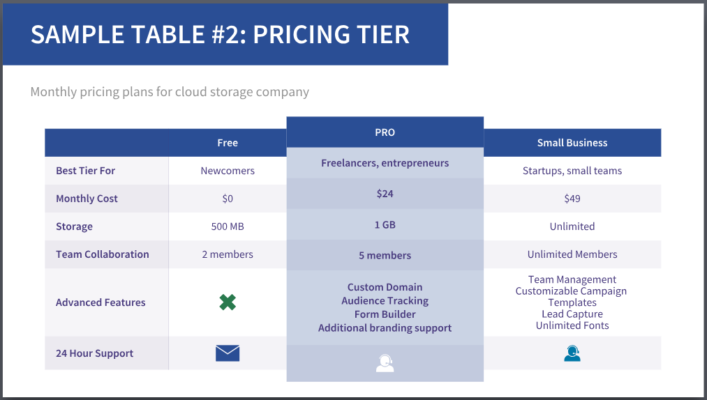
This “Pricing Tier” example shows a data table with monthly subscription rates for a cloud storage company. Every service-based company or startup will need a pricing structure template like this. But how many have you seen out there on different software or service websites that look confusing, hard to understand or just plain ugly? This smart template from Beautiful.ai makes it so much easier to create a professional-looking Pricing Tier data table, with highlighted sections, image capabilities, and easy-to-add icons.
In the pricing structure below, the highlighted column is the Pro option. The creator of the data table wants the user to see this tier first, hoping that they will choose it (leveraging simple psychology principles of visual impact). It is definitely the best value out of all the other tier options — and visualizing the data this way couldn’t be any easier.
THE BEST WAY TO ORGANIZE YOUR DATA IN A DATA TABLE
Once you collect all the information you want to include in your data table, it’s time to plug it in. These smart table templates will save you lots of time by making the rows and columns look great and easy to read. But what goes where?
If the values along the horizontal line are time-based, place the data in order from oldest to newest (from left to right). If the horizontal line is for monetary (money) values, set it up from lowest to highest (again, from left to right). For vertical values, it can vary according to what the table is about. A good rule of thumb is to order from most important to least, in descending order from top to bottom.
Another powerful way to create impact with your data is with the colors that you use for the data table. Thankfully, Beautiful.ai helps you maintain a color theme automatically. When you click on the color palette you want, content throughout the entire table will instantly change to that color — voila!
The example below is a data table showing the competitive matrix of the Beautiful.ai presentation software compared to other presentation tools. As you can see, the data is ordered in a progressive fashion. When data is more qualitative (text) and not quantitative (numbers), you can determine how your viewer absorbs the information with the use of icons, photos and logos.
For example, showing half-full stars for the other presentation software tools, but full stars for Beautiful.ai, gives it a huge visual advantage. It’s clear from this data table that Beautiful.ai has more features and benefits than the other presentation software options — which means it's a great powerpoint alternative.

IN CONCLUSION
As we have seen in the three examples above, using data tables can save lots of time when it comes to explaining things to clients, prospective collaborators, and other members of your audience.
Remember, a table is the best way to visualize your data's story if:
- The data includes exact numerical values that need to be referenced
- There are 3 or more categories that need to be represented in the left-most column
- The values vary greatly and would make a line graph confusing to read
- The values don’t tell a cohesive “upwards” or “downwards” story
- You need to compare more than 3 companies or products
Good luck and happy data table creating! If you have any questions, you can leave a comment in the section below, visit our FAQ page or email info@beautiful.ai.
